


The dashboard
The dashboard sums up the orders your coupons brought in over a period: how many there were, how they ended, what they sold and, with commission on, what they earned. This article explains every figure and chart on it.
Go to Affiliate Reports → Dashboard. The dashboard covers the period and filters chosen in the bar at the top, the last 30 days unless you changed the default. See Filtering the reports.
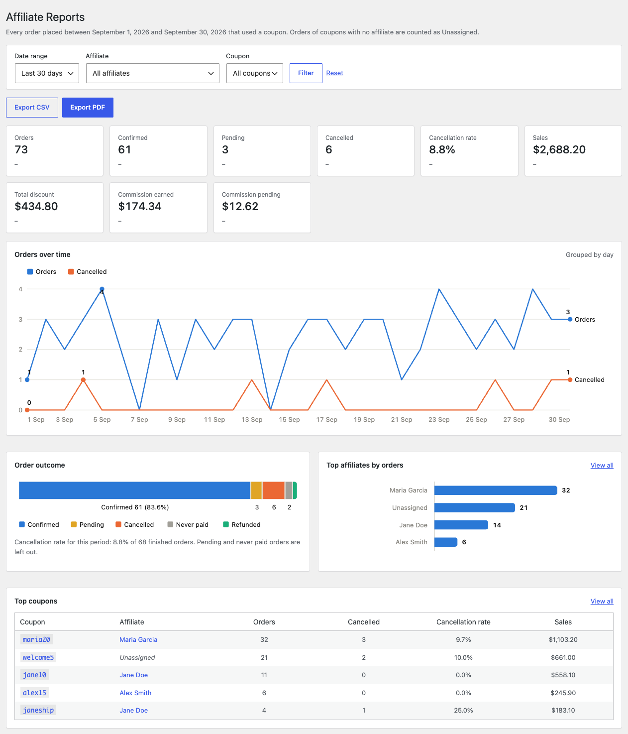
The figures
| Figure | What it shows |
|---|---|
| Orders | Every order placed in the period that used a coupon, whatever happened to it. |
| Confirmed | Orders counted as confirmed, such as those Processing or Completed. |
| Pending | Orders whose outcome is not known yet, such as Pending payment or On hold. |
| Cancelled | Orders cancelled after they were paid. |
| Cancellation rate | Cancelled orders as a share of finished orders. |
| Sales | The totals of confirmed and pending orders, less anything refunded. |
| Total discount | What the coupons took off confirmed and pending orders. |
| Commission earned | Commission on confirmed orders. Shown only while commission tracking is on. |
| Commission pending | Commission on pending orders. Shown only while commission tracking is on. |
Each order counts once, even when it used more than one coupon. Orders that used a coupon with no affiliate are included; the reports list them as “Unassigned”. What confirmed, pending, cancelled, never paid and refunded mean, and how the cancellation rate is worked out, is explained in Order outcomes and the cancellation rate. For what sales and discount include, see The Affiliates report.
Compared with the previous period
Under each figure, a line compares it with the period just before, of the same number of days. For example, the last 30 days are compared with the 30 days before them.
- “▲ Up 25.0% vs previous period” or “▼ Down 10.0% vs previous period” give the change as a percentage of the earlier figure. For the cancellation rate too, this is a relative change: a rate going from 10.0% to 12.5% reads “Up 25.0%”.
- “No change vs previous period” means the change is under 0.05%.
- A dash means the previous period had nothing to compare with.
The charts
- Orders over time draws two lines, all orders and cancelled orders, for each day of the period, or for each month when the period is longer than 62 days. Hover over a point to see its figures.
- Order outcome splits the period’s orders into confirmed, pending, cancelled, never paid and refunded, with the share of each. Below it, a sentence gives the cancellation rate and the number of finished orders it was worked out on, for example “Cancellation rate for this period: 12.5% of 8 finished orders. Pending and never paid orders are left out.”
- Top affiliates by orders shows the eight affiliates with the most orders. Orders of coupons with no affiliate can take one of the places, as “Unassigned”. View all opens the Affiliates report with the same filters.
- Top coupons lists the ten coupons with the most orders, with their affiliate, orders, cancellations, cancellation rate and sales. View all opens the Coupons report.
When the period has no orders, each chart says “No data for this period.”
Export and print
Export CSV downloads the figures of each affiliate as a spreadsheet file, and Export PDF opens a print layout of the dashboard. See Exporting and printing reports.